tl;dr
Charming Robot used its experience in the fashion space to forge an ongoing relationship with Rachel Zoe and her team, working closely for the past 4 years on content, ecommerce and design projects.
- Content Strategy
- Ecommerce Design
- User Experience
- Visual Design
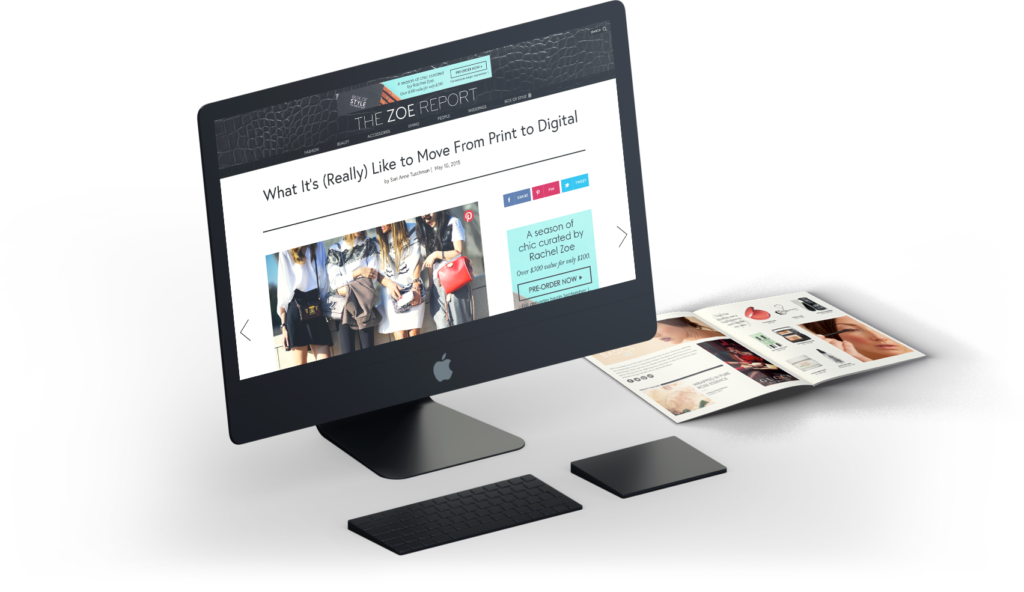
Rachel Zoe, American fashion designer, businesswoman, stylist and editor, needed help. At the time, she was wrapping up the final season of The Rachel Zoe Project on Bravo and was looking to put a higher focus on her content site: The Zoe Report. The site had a strong following but was sporting an outdated design that didn’t reflect her brand’s elevated image and made it harder to attract high-end advertisers.
Make it Maj, Babe
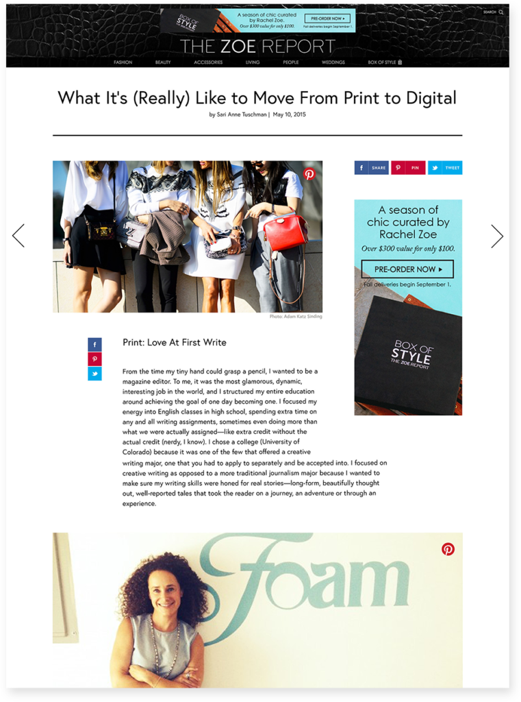
Before anything else, we needed to make sure the site’s structure was optimized. Charming Robot sat with Zoe’s digital and editorial teams and audited the existing site, highlighting what should stay, what should go and what needed tweaking. Our UX team began the task of reorganizing and creating user flows, pages and templates to provide a site experience that encouraged interaction and exploration for the user while being flexible and modular enough for the editorial team to have total freedom to create anything they wanted to.
One of the keys to success was to vary and enhance the content types. The Zoe Report was one of the first sites to do a commerce-in-content native ad model, and we expanded this by making it live and editable in the CMS. We also introduced the concept of cascading product counts. As a piece sold out on an affiliate’s store, a backup was ready to replace it, without an editor’s intervention. The expansion of evergreen content (interviews, tips, etc) ensured that a user would always be able to find content that suited her tastes, even after of-the-minute fashion content had been seen.
For design, we worked closely with the editorial staff to create a look that was as modern and high-end as Rachel herself. A screen-wide, high-contrast design with a touch of luxe texture brought the feeling the site had been needing. Coupling that with the live layout elements and a sleek typeface (Europa) that pulled it all together and the site was ready for code. As with many of our projects, we had the in-house development team in on our meetings, so transition into code was seamless.
The results were impressive. The sleek design was now attracting much bigger advertisers and the content strategy kept users on the site, doubling monthly unique visitors and tripling the site’s pageviews.
Bringing the shopping home
About a year after we launched thezoereport.com, the Zoe team enlisted Charming Robot to create a new \ ecommerce site for Rachel’s clothing line. The line had been selling through affiliate retailers but the site itself (shoprachelzoe.com) was only being used to push to those locations. The time was right to introduce direct-to-consumer ecommerce and create a true home for these unique pieces.
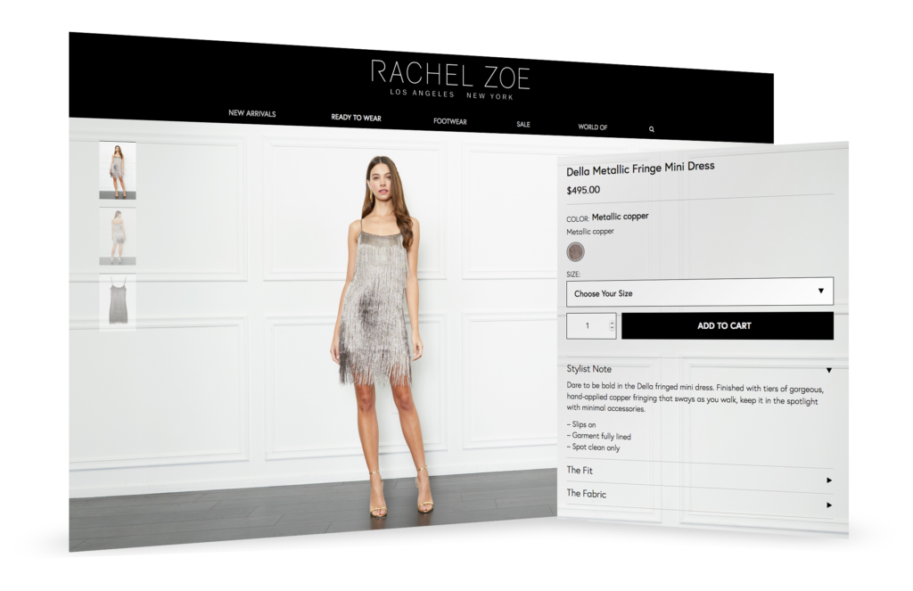
Our goal with this design was to combine clean, efficient functionality with a design that gave the feeling of being in an airy loft boutique. A place where you weren’t just buying clothes, but walking into a space that was created for you. The open layout of the design gave product shots a gallery to be displayed in while making all the purchase decisions clear and easy.
We combined clean functionality with a look that emulates a loft boutique
In our experience, we found that a little content in the commerce experience helps to add a story to the product and increase consumer engagement and ultimately, sell-through. Stylist tips (sometimes from Rachel herself) added encouragement, explaining why she loves a piece and possible ways to dress it up or down.
A well-dressed pair
We have been able to so some incredible work for these sites, and couldn’t have done it without Zoe’s in-house team. Any time we can combine our expertise with a client’s experience and capabilities we’re able to create an outcome exponentially greater than designing in a vacuum, and if you gel as a team the results are even better. With us and the Zoe team, we go together like a white tee and a leather jacket.

