tl;dr
From bare wires to polished packaging, we worked with Kinsa to build a product and a brand that would fit right in on the shelves of the Apple store.
- Brand Strategy / Identity
- Packaging
- Product Strategy
- User Experience
- Visual Design
It was a circuit board and some bare wires. Attached was a battery on one end and a metal probe on the other. I considered the request for a moment, weighing how badly the 9-volt could hurt me if everything went wrong, and went for it. Silently the numbers incremented. 98.5° read on the display. Healthy enough! But Inder Singh’s aim was a lot bigger than just taking my temperature. He wanted to use this little stick to map the health of the entire world. And he was going to need the help of a lot of people.
Charming Robot’s mission was clear: Help strategize and prioritize the flows for Kinsa’s MVP and create a brand that would resonate with their target audience of younger, first-time moms.
Creating the brand helped pave the way for a unified look when we worked on the look and functionality of the app and the hardware.
Creating a Familiar Experience
The first iteration of the product had to center the experience around a single function: taking a temperature quickly and easily. If it couldn’t hit that mark, none of the additional features would matter. Our UX team set to work creating flows and features, reviewing and paring back to an MVP that was everything it needed to be and nothing it didn’t.
Anyone who has ever held a sick, crying baby knows that a little distraction is a welcome thing.
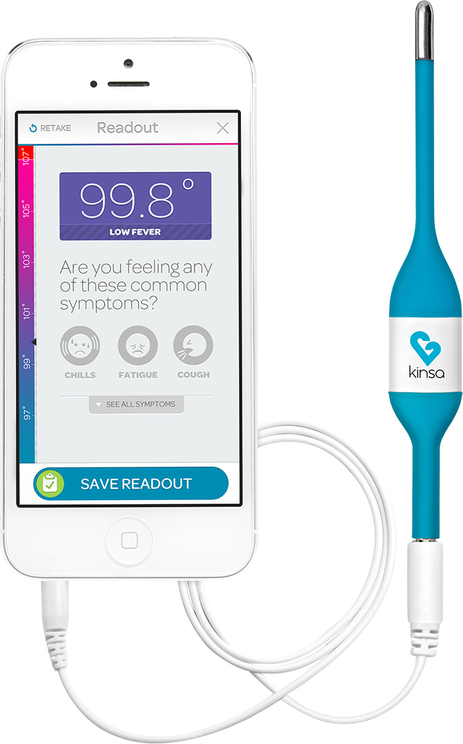
We used the opportunities of a smartphone-connected thermometer to stand above the competition. Storing previous readings to share with a doctor, adding symptoms to a reading and, most important crystal clear notifications were all natural benefits of using a powerful device as the base. We took advantage of the screen to turn the at-best-tedious process of using a stick thermometer into something that a child (or sick adult reverted into a childlike state) would enjoy and even look forward to.
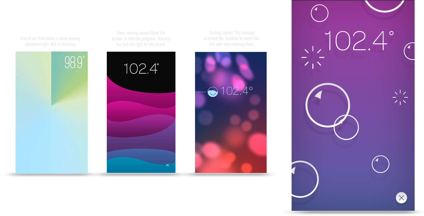
Designing to Calm
The core of Kinsa’s MVP was the temperature-taking process. We had a huge opportunity with a smartphone thermometer to use the screen to distract an uncomfortable kid. These are a few of our explorations. Biggest is the winner, the soap bubbles. Clear at a glance and the popping game added into it makes it a great distraction.
Creating the symptom icons was one of the most fun parts of the project. The challenge was treating the situations with respect but also bringing in the realistic grossness that comes with some of the afflictions. Fun fact: we have a whole page of unused, unshown, and hilarious diarrhea icons.
A Brand to Soothe
Kinsa’s mission began in the medicine cabinet, and to get there they needed an audience that didn’t yet have a competitor already there. Young, first-time mothers made the most sense: they’re frequently worried sick and need as much help as they can get. We crafted the brand strategy around a sense of calm positivity and used that to guide every decision made, from the logo to animation, from palette to packaging.
Anyone who has ever held a sick, crying baby knows that a little distraction is a welcome thing. We explored fun methods of interaction to enhance the experience, small animations that caught the eye, and adding a gaming element to the reading process. Through all of these we found that we were able to capture the attention of a child and keep them occupied while the reading is being taken.
The brand resonated and commanded better retail placement, including space on the shelves of Apple stores.
From launch to beyond
Kinsa certainly did not suffer from launch paralysis. The moment the product was ready, Inder pulled the trigger and brought it to life. Together we watched how it was being used, to make tweaks and iterations, to react and make the product even better.
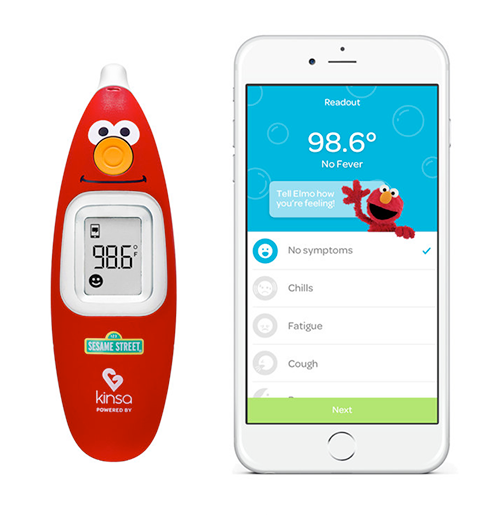
We were already at work on the new features to start achieving the bigger mission. The anonymous data could give a lot back to users; not only to track when you’re sick, but to help stop you from catching something before you get it. We helped to create grouping functionality, letting a user see if a bug is going around their school or neighborhood. When there was enough data to be useful, the feature was launched. Other features were planned and developed, but we can’t talk about those just yet. Perhaps most exciting (and a true testament to the product) is the partnership with Sesame Street, licensing a special Elmo version of the ear thermometer, and bringing all the familiar characters into the app.
Over time Kinsa built up their team, bringing UX and design in-house, slowly reducing their need on outside firms. We still come in for an outside perspective from time to time, but they’re largely flying on their own, and it’s been a pleasure to lend our talents to get them there. For Kinsa, the mission to map the health of the world is more and more attainable by the day.