tl;dr
Charming Robot designed and developed KFF’s Health System Tracker site to be more visual and engaging with better ways to explore the content.
- Front-end Dev
- User Experience
- Visual Design
In 2016, The Kaiser Family Foundation came to us looking to redesign a joint site they have with the Peterson Center on Healthcare. The Health System Tracker (healthsystemtracker.org) gives up-to-date information on the performance of the healthcare system in America with the goal of finding ways to improve it. At the time their site lacked a song sense of hierarchy or ways to easily promote and feature new content. The team was also looking to create a dashboard of indicator charts and snapshots that could be used to quickly get a high level overview of how the healthcare system was performing across different verticals.

Stats on the go
We focused on making the mobile experience as rich and interactive as possible, extending up into the desktop experience to create an immersive environment no matter the screen size.
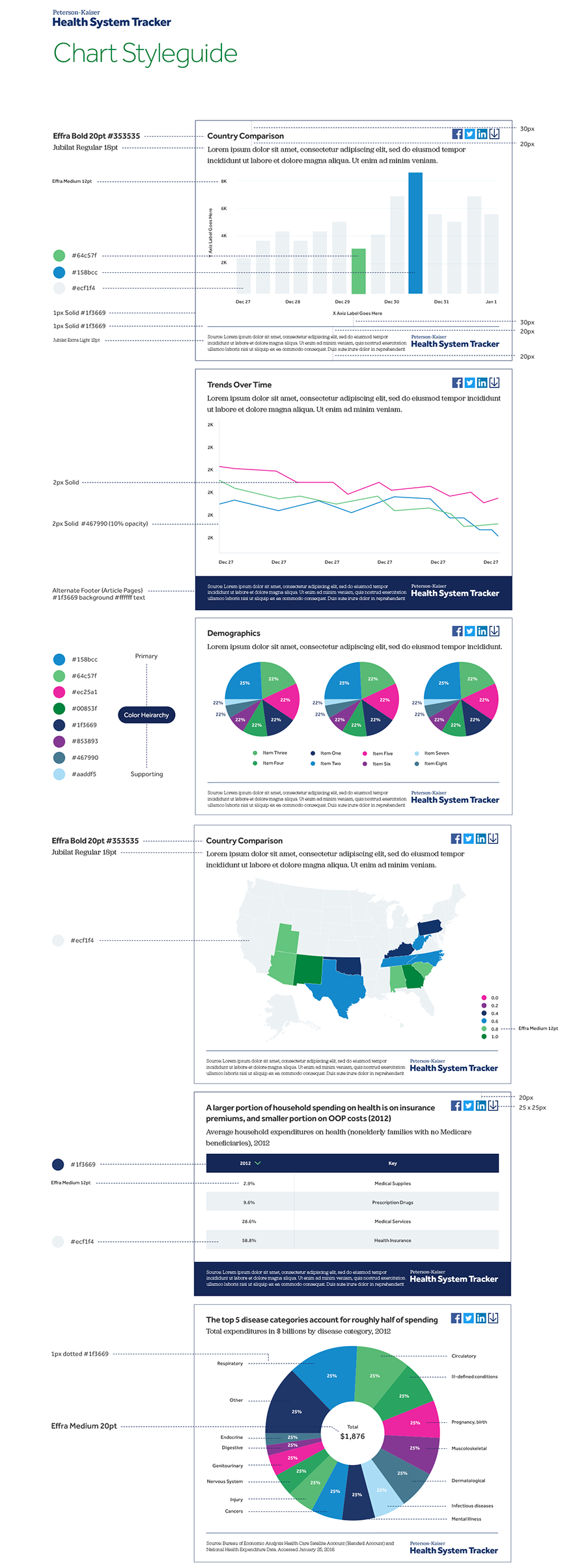
We created a detailed style guide to accompany our work so that all future charts created in the system would fit in the same standards.
Just because we were dealing with a site heavy on research content, it didn’t mean that we couldn’t still lean on many of the design lessons learned from media content sites. It was important to the KFF team, and to us, to make sure that their featured content had a place to shine on the homepage, so that that site looked alive and could be noticeably refreshed often for those who wanted to get an overall snapshot of the content. Equally important was to structure things in a way that someone coming in who was looking for research on a specific category could easily find it, and like with media content sites, give them opportunities to find related content to keep them engaged.
Just because we were dealing with a site heavy on research content, didn’t mean that we couldn’t use lessons learned from media sites.
Another priority was to create a Health Tracker dashboard, where the KFF team could give visual chart- and number-based snapshots of key indicators across each category, so that users could get a quick overall assessment of how the health system was performing from a high-level perspective, which would then allow users to drill down as desired to uncover more within each main vertical. This needed to have a look and feel that separated it from the main content part of the site, and made it special, while allowing the charts and numbers to be easily scanned.
Bringing It to Life
After the designs were done, KFF asked us to develop the site on WordPress, which they were already familiar with from their current site. We love when we are able to do this, as it gives us control over how the designs are brought to life and ensures that they are able to be as close to the vision we intended. This involved us working with the KFF team on how we could make their publishing workflow process on the backend simpler and included helping them integrate a new charting library they had switched to for their data visualizations. The site is fully responsive and gives them multiple ways to publish their charts as embeds and images.
A Healthy Partnership
Working with the KFF team to bring their vision to life made this a project we ended up really happy with and continue to work with the KFF team on making the site even better now that it has launched, and finding other ways we can help improve their workflow in admin.